Theme Components
Overview of theme-specific components and patterns
Theme Components
The default theme includes several pre-built components that extend the core component library.
Navigation Components
MainNavigation
The primary navigation component with responsive behavior:
import { MainNavigation } from '@/contents/themes/default/components/navigation'

<MainNavigation />
Features:
- Mobile hamburger menu
- Desktop horizontal navigation
- Active link highlighting
- Authentication-aware menu items
UserMenu
User account dropdown with profile and settings:
import { UserMenu } from '@/contents/themes/default/components/user-menu'

<UserMenu />
Layout Components
DashboardLayout
Standard dashboard layout with sidebar and header:
import { DashboardLayout } from '@/contents/themes/default/components/layouts'

export default function DashboardPage() {
  return (
    <DashboardLayout>
      <h1>Dashboard Content</h1>
    </DashboardLayout>
  )
}
AuthLayout
Centered layout for authentication pages:
import { AuthLayout } from '@/contents/themes/default/components/layouts'

export default function LoginPage() {
  return (
    <AuthLayout>
      <LoginForm />
    </AuthLayout>
  )
}
Component Guidelines
Composition Over Modification
Always compose upward from core components. Never modify shadcn/ui components directly.
// ✅ CORRECT
import { Button } from '@/core/components/ui/button'

export function ThemeButton({ children, ...props }) {
  return (
    <Button {...props} className="theme-specific-styles">
      {children}
    </Button>
  )
}

// ❌ WRONG - Don't edit core/components/ui/button.tsx
Accessibility First
All theme components must include:
- Proper ARIA labels
- Keyboard navigation support
- Screen reader compatibility
- Focus indicators
Responsive Design
Use Tailwind's responsive prefixes:
<div className="grid grid-cols-1 md:grid-cols-2 lg:grid-cols-3">
  {/* Responsive grid */}
</div>
Layout Examples
Desktop Layout
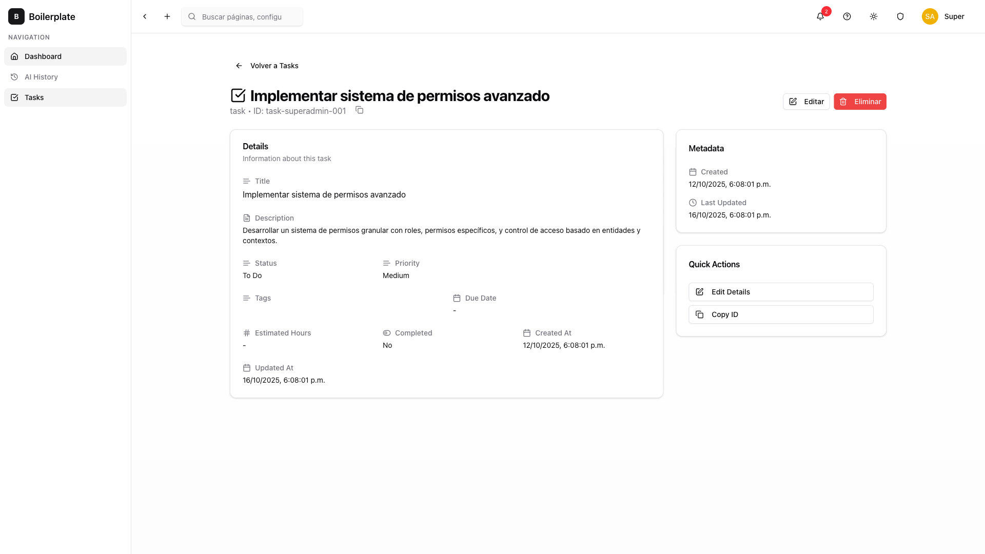
The theme provides a responsive desktop layout with a fixed sidebar and scrollable content area:

The layout adapts automatically to different screen sizes:
- Desktop (≥1024px): Fixed sidebar navigation with expanded content area
- Tablet (768px-1023px): Collapsible sidebar with full-width content
- Mobile (<768px): Hidden sidebar with hamburger menu toggle
Adding Images to Documentation
Images can be added to documentation by placing them in the appropriate directory:
For theme documentation:
# 1. Place image in theme's public/docs/ directory
contents/themes/default/public/docs/your-image.png

# 2. Run theme build (or automatic in dev mode)
npm run theme:build

# 3. Image is automatically copied to public/theme/docs/
For core documentation:
# Place directly in public directory (no build step needed)
public/docs/core/assets/your-image.png
Then reference them in markdown using absolute paths:
# Theme docs

# Core docs

Important: All theme public assets (including documentation images) must stay within contents/themes/[THEME]/public/. The build system automatically copies the entire public/ directory to /theme/. This ensures all assets are theme-specific and change when switching themes.